Calm Technology - CTA train tracker

This is the first in a series of projects that will be developed around the idea of applying "calm technology" to product design. Coined by Mark Weiser and John Seely Brown at Xerox PARC in 1995, calm technology can de defined at a high level by the following:
First, by placing things in the periphery we are able to attune to many more things than we could if everything had to be at the center. Things in the periphery are attuned to by the large portion of our brains devoted to peripheral (sensory) processing. Thus the periphery is informing without overburdening. Second, by recentering something formerly in the periphery we take control of it. Peripherally we may become aware that something is not quite right, as when awkward sentences leave a reader tired and discomforted without knowing why. By moving sentence construction from periphery to center we are empowered to act, either by finding better literature or accepting the source of the unease and continuing. Without centering the periphery might be a source of frantic following of fashion; with centering the periphery is a fundamental enabler of calm through increased awareness and power.
The goal of calm technology is to have technology serve humans, not the other way around. In today's world of being bombarded by ads, smartphone distractions, and apps that compete for our attention, it should be a goal to reduce technology to its essentials and push it to the background, while also allowing it to come to the foreground when it needs to. I think this is going to be a big thing in the coming years, partly as a reaction to the poorly designed technology experiences we are forced to deal with today.
Building a better train tracker
One area I lose a lot of time to technology is in figuring out when the next CTA (Chicago Transit Authority) train will be arriving. The timetables are not real-time so do not account for delays and having to pull out my phone to see when the next train is arriving and when I should leave in order to catch it inevitably leads to being distracted by the gateway of information a smartphone provides. This project was built so that I could easily and almost sub-consciously check when I should leave from my home to catch my next train.
Design considerations
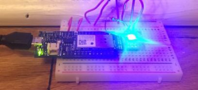
The device is built using an Arduino MKR1000 powered externally and a single WS2812B LED, so these were the hardware parameters that were designed around.
Several considerations were given to solutioning for this design:
How many trains should this track? From which station, and in which direction?
How should the notification system operate? At what frequency?
How should this be designed so it operates at the periphery?
What technology choices should be made so that this device is a good "technical citizen"?
In order to quickly get this built and test its efficacy, the decision was made to just track one train line, station, and direction for now (the nearest line and station to my residence, and the direction I am most often heading in).
As for the notification system light and color were chosen due to their ambient, peripheral qualities. Obviously having an additional or alternative notification system that relies on a different medium (color choices, sound, etc.) would be necessary for those that are blind or color-blind.
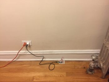
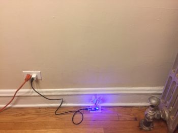
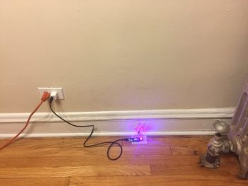
Now there were several considerations given to frequency (times) of the light being displayed and which colors to use. The decision was made to calculate time based on travel time from my residence to the station, thereby reducing one more cognitive step (addition of travel time to station plus arrival time). A train tracker will tell you when the next train is arriving but does not usually include the buffer time you need to give yourself to leave from your location. It was a very conscious decision to avoid using red, yellow, and green as these colors already have meaning in relation to transportation and time. If the LED was set to red would that mean the train was delayed? Stopped on the tracks? Would it mean I should stop? If it was green would that mean I should leave? Would it mean the train is going and has already passed my target station? Note here that as the station is about a 6 minute walk away and I don't want to wait at the station for that long, any train that will be arriving within the next 6-8 minutes will be "time to leave," with 5-6 minutes being "I might make it in time" and less than 5 minutes being "too late". The LED used is programmable, so there is only one light source and the colors settled on were blue (neutral) for "time to leave," purple (neutral, but with enough red in the hue that it suggests importance or urgency) and nothing (LED off). The original design had the LED turn on to a brownish yellow if I had missed the time to leave for the train, but in order to reduce the cognitive processing needed by the user and to not distract, it was changed to just turn the LED off. The LED stays on and at its current color until a change in state of the train's arrival time. So the design ends up looking as below:


While periphery choices have already been discussed, it is important to note that as this device is designed to be running in the background all the time when it is turned on, sound as a notification was decided against. It would get annoying very quickly hearing even pleasant "time to leave" sounds due to the frequency at which trains arrive and leave the station. Light is more ambient and less disruptive. Also, the LED used is just small enough to not stand out, but bright enough to be noticed when you want to check if it's time to leave.
In order to provide timely estimates, the Arduino fetches arrival time data from the CTA Arrivals API every 10 seconds. This seemed like the right balance between betwork bandwidth with getting timely data. Bandwidth used is already tiny (data is returned in JSON format in a few bytes) and the code is optimized to account for small Arduino RAM and storage size. And to turn off the device when it's not needed, the on-board Arduino power button is used. It can also be unplugged from power and will restart automatically when it's plugged back in.
Next steps/future improvements
As this is the first iteration of this product, several ideas may be implemented in the future. A priority is designing a physical case for this device to be housed in, removing wires from the user's view and further reducing it to its bare essentials aesthetically. There might be several devices that a user has in their home/office/wherever this device might be installed that similarly rely solely on light as notifications, so some differentiation would be required here. Whether this is done through changing the light patterns, or probably more effectively, adding some simple signifier to the physical design of the housing, it should be obvious to the user what the purpose of this device is while still remaining on the periphery. Another improvement would be around power, as the device currently runs while plugged into AC. Moving to a long-lasting battery would make it easier for the user to move the device to another location while also further hiding the technology itself (wires) from view.
Lastly, getting this in the hands of real users and doing user testing would be valuable for product improvements. I've got some ideas for adding sensors to this to have some internal metrics running for product feedback too.